Setting a flexible baseline grid in CSS
How I attempted to recreate InDesign’s ‘baseline grid’ using CSS

I am an independent full-stack developer from the Netherlands. I also specialize in design (both on- and offline) and making music.
Update aug 2025: I am working on an updated version of this, and will write a follow-up article soon. The updated version is entirely driven by (modern) CSS, without any SASS precompiling. It’s dynamic, and scales to any size (see the demo below). It only needs a few lines of JavaScript to conform block elements (images) to the grid. Work in progress here:
For all things layout, I’m used to working in InDesign, which offers the quite useful (and, on occasion quite frustrating) ‘baseline grid’ which aligns all text/objects to a grid, creating what the cool kids seem to call ‘vertical rhythm’. So, for web pages, it’d be great to have such a thing. Sadly, this doesn’t yet exist, which means we’ll have to build it ourselves.
I was curious if I could implement a baseline grid using pure CSS, and keep it as dynamic (responsive, even) as possible. Turns out I can! Well, not using 100% pure CSS, as I needed a wee small bit of JavaScript to make it work for images as well, but hey; close enough.
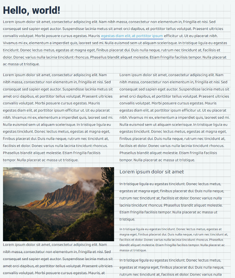
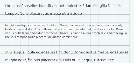
In this article, I’ll talk you through how I turned this:
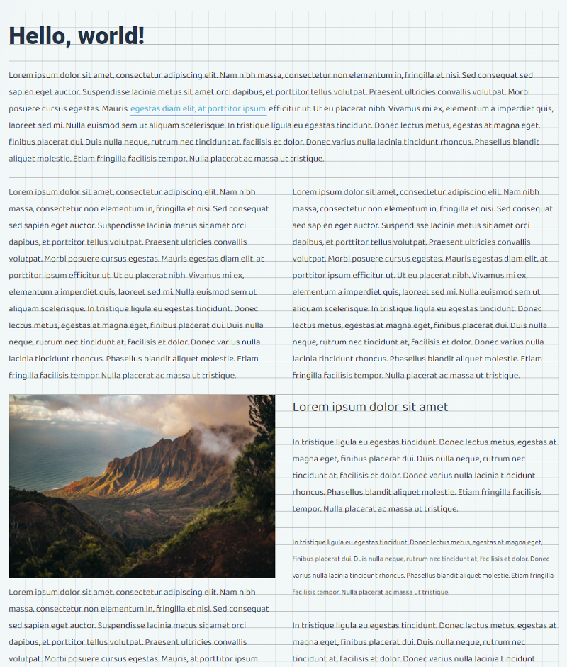
Into this:
(or, visit the demo page)
Focus on Flexibility
There are quite a few articles on creating so-called ‘vertical rhythm’ in CSS, and most are based on quite arcane calculations, and require a lot of preprocessing, making the CSS both static and bloaty. So primarily, my aim was to make a system that was flexible, or I’d discard it completely, and use one of the methods developed by others.
Typography in CSS
The implementation of typography in CSS is, unlike what you’d expect of a system for styling text-markup and layout, hampered — at best. To best illustrate this, I created this image, which shows the components of basic typography on the left, and the equivalent properties/units CSS provides us on the right-hand side. As you can see, there’s quite some basic stuff missing (as of 02–2022).
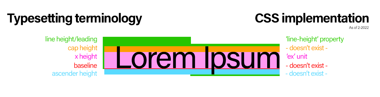
The main problem is that CSS has a different approach to line-height. Normally, line height (also known as leading) controls the amount of space between baselines in a block of text.
While this is also true in CSS, the difference lies in the placement of the text. You can see this in the above illustration. While text should be aligned to its baseline, on the bottom of the line-height, CSS lines up text in the vertical center of the line-height.
In other words; other than the actual height, the exact placement of the characters is beyond our control. We have no choice but to take for granted it's vertically aligned in there.
All this taken into account, there is still enough ammunition to work with, so let’s crack on.
In all examples I’ll use these basic settings: font-size is set to 16px, line-height to 30px (the actual ‘baseline’ we’re aiming for), and no margin and padding set for the text elements.
Forcing a baseline
The most important thing in the baseline grid is — you guessed it — the baseline. The problem is: CSS doesn’t provide us with the means to set it (see above) so we need to doctor it out:
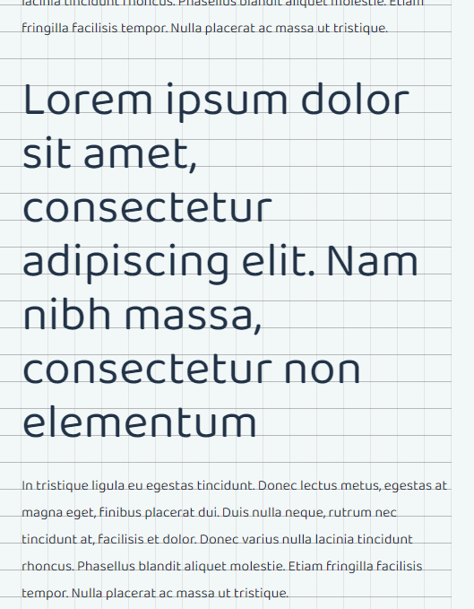
This is what we’d get (the assistive grid is a background pattern, set at 30x30px — same as the line-height) with only the basic settings (see above):
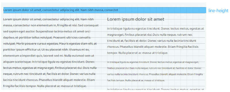
The line height is correct, and the font lines up in the center of the grid row. But as we travel further down the page, things start to unravel quickly, and when elements with larger fonts are introduced, things go askew even further. We need to make sure all lines, big and small, always align to the grid perfectly.
Ex aequo, or: the holy grail of a flexible baseline grid
To place the text precisely on the line of the grid row, we need to push it down a bit by adding top padding. The trick lies in calculating exactly how much padding is needed, preferably regardless of font-size.
And now we've come to the point that offers us great flexibility, and eliminates the need for any pre-defined (SASS-based) formulas: the browser can give us the exact x-height we need for this calculation, at the time of rendering: the ex unit. This unit has very broad support (97.41% at the time of writing) so I consider this safe to use.
We need the character’s ascenders to drop below the grid line, while keeping the characters on top of it, like so:
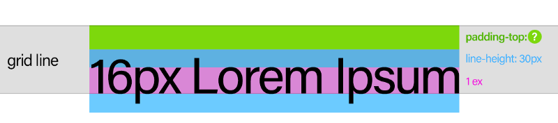
Finding that magical padding-top is the holy grail of the baseline grid. And, making use of the ex unit, here's how I solved it:
.baseline-grid p { #add more text-elements to the selector if needed (for instance '.baseline-grid blockquote')
    line-height: 30px;
    font-size: 16px;
    padding-top: calc((30px - 1ex) / 2);
}
This breaks down to:
Take the line-height (
30px)Subtract the x-height (
1ex) from itDivide the result in half (since the characters are vertically middle-aligned)
That’s it. You don’t even need to know the font-size for this, as the browser knows the precise pixel-value of 1ex. It knows that this ‘ex’ represents the vertical size of the letter ‘x’, of the current font, at the current font-size, as it appears in this particular element. It knows this because it just rendered the text itself.
So, that’s it?
While this calc() rule gives us a baseline that is easy to work with — as it is entirely dynamic, and only requires the one value we wanted to set as an 'argument': the line-height, which we can now refer to as the baseline (30px in the example) — we’re not quite there yet.
Because when applied, we now get this:
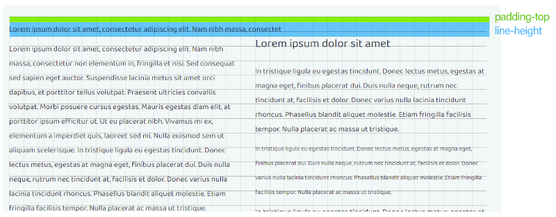
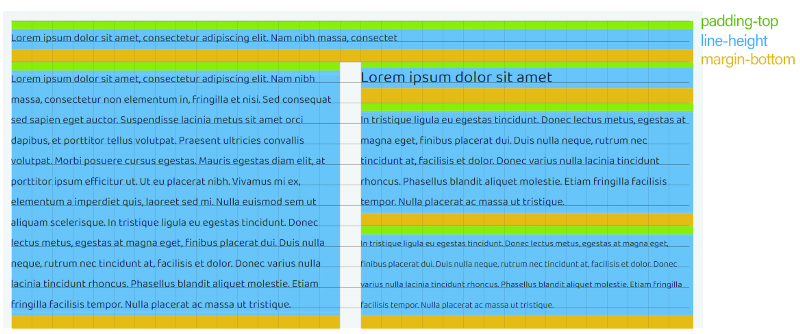
While the line now sits perfectly snug on our 30x30 pixels grid baseline, you'll notice still things fall apart further down. Fortunately, this is easy to solve: it all comes down to adding a bottom margin to each text element to make it fit the grid:
.baseline-grid p {
    line-height: 30px;
    font-size: 16px;
    padding-top: calc((30px - 1ex) / 2);
    margin-bottom: calc(30px - ((30px - 1ex) / 2));
}
This breaks down to:
Take the line-height (30px, by now a.k.a. the baseline)
Subtract the same padding we added to the top from it
Add it as bottom-margin
That’s it. Everything now fits and aligns perfectly, big and small:
To make things easier on yourself, consider putting the calculated baseline padding into a CSS variable:
.baseline-grid p {
    line-height: 30px;
    font-size: 16px;
    --baseline: calc(((30px - 1ex) / 2));
    padding-top: var(--baseline);
    margin-bottom: calc(30px - var(--baseline));
}
Now we have everything, right?
Right. Well, no. Well, nearly. There are two things left: handling large font sizes, and one special category called inline-block elements (images, mainly)…
Dealing with large font-sizes
What happens if the font size far exceeds the baseline grid size? It becomes a problem:
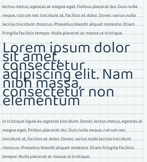
This is a blockquote at 54px font-size (and still 30px baseline grid)
The only correct way to deal with this is to multiply the baseline grid size for this specific element so it will double (or triple, or quadruple, depending on font-size) the line-height.
Here comes the SASS
Now, you could write CSS, in which you’ll manually try to pinpoint the cut-off values that determine the font-size/baseline-multiplier ratio, but this is really where CSS preprocessors such as SASS stand out: they will magically handle all the math for us, dynamically, based on whichever font-size we throw at it.
Here’s how I handle it:
$lh-base:           30px;
$multiplier:        ceil(math.div($font-size-px, $lh-base));
$baseline-grid-size: $lh-base * $multiplier + px;
What this does, is that it divides the font-size you provide it ($font-size-px) by the default baseline grid and rounds that number up to the nearest whole number. The resulting value is the multiplier we need to increase baseline grid size.
So, say you’d pass it 54px font-size, you’d get 54px / 30px = 1.8. Rounding that up will produce 2. So the new line-height will be 30px * 2 = 60px.
Voila:
To make sure everything will still line out properly, we also need to update the baseline padding we set earlier, so it matches this new line-height. For easier readability, and — more importantly, easy adjustment for responsiveness later on — it’s best to write the grid size in a variable as well.
So the whole thing becomes something like this when written into a reusable mixin called alignToGrid:
@mixin alignToGrid($font-size:16px) {

    $lh-base: 30px; //preferrably use a global variable for this for greater flexibility
    $multiplier: ceil(math.div($font-size-px, $lh-base));
    $baseline-grid-size: $lh-base * $multiplier + px;

    --baseline-grid-size: #{$baseline-grid-size};
    --baseline: calc(((var(--baseline-grid-size) - 1ex) / 2));

    line-height: var(--baseline-grid-size);
    padding-top: var(--baseline);
    margin-bottom: calc(var(--baseline-grid-size) - var(--baseline));
}
Using it will then be as easy as:
.baseline-grid p {
    @include alignToGrid(54px);
}
Update march '22: There is a way to make CSS do ceil-rounding. It only works in Edge/Chrome/Android/Opera Mobile for now, but it's a very interesting technique. See the demo for an explainer: https://code.hnldesign.nl/baseline-grid/#explain_recalc
And what about images?
Images also need to conform to the grid. It used to be hard to make this work until the magic of CSS’ object-fit property came along. Setting this property to 'cover' allows us to set a fixed height for an image, with a responsive width (usually 100% of the parent), without squashing or stretching the image:
.baseline-grid img {
    width: 100%;
    -o-object-fit: cover;
    object-fit: cover;
}
So the only thing left to do is make sure all images in the grid are of a height that is a multiple of the grid size. And the only way to do that, is by using JavaScript (there goes my hope of solving things 100% using CSS).
Here’s a simple example for a function that adjusts an image to the baseline grid:
function correctLineHeightMargin(el) {
    window.requestAnimationFrame(function(){
        el.style.setProperty('height', null); //unset any fixed height added on earlier so as not to mess up calculations
        window.requestAnimationFrame(function(){ //wait until the height reset is drawn before re-measuring the height, or it might fail
            let h = el.getBoundingClientRect().height; //get rendered pixel height
            let elStyle = window.getComputedStyle(el);
            let gridSize = parseFloat(elStyle.getPropertyValue('--baseline-grid-size')); //get the baseline grid size we set
            el.style.setProperty('height', Math.round(h / gridSize) * gridSize + 'px'); //rounds off height to a multiple of grid size
        });
    });
}
There are a few critical pointers:
You must adjust the image size as soon as the image is rendered on the page, so the original dimensions are known, or the adjustment will fail.
Depending on the speed of the transfer of the images, that moment may;
A) have already passed, or B) is still waiting to happen.As soon as the layout of the page changes (resizing/changing orientation) you must recalculate and readjust.
This means you’ll need to:
Check the
completeproperty of the image (indicating thesrchas loaded)Bind to the
onloadevent of the image (in case it’s notcompleteyet)Bind to any event that changes the layout. I suggest binding to the event that triggers a responsive breakpoint, such as this script I wrote.
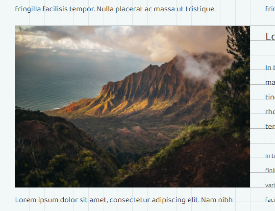
If all goes well, it will turn this:
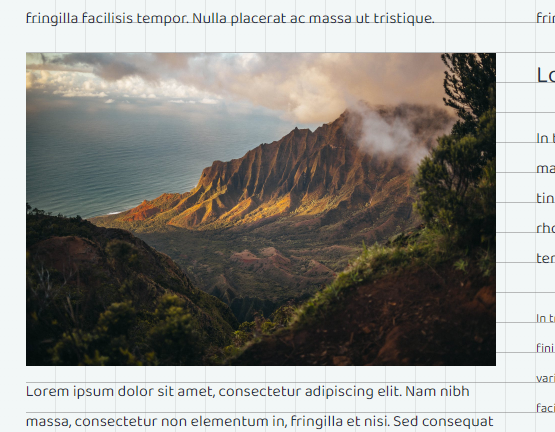
Into this:
Jumping baselines
A thing to keep in mind when you just can't seem to get it right, is that (web) fonts tend to ‘jump around’ slightly going from small to larger sizes, requiring an ever so slight additional offset to their padding to make them conform to the grid. This increases just as the font size increases. The only way to find out how much additional padding is needed, is to experiment what works best. A really, really good tool to help you with this, is the baseline calculator by Lee Jihye
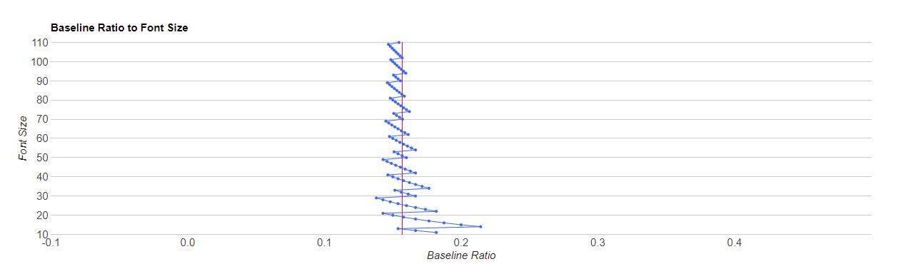
Example: if you look up Roboto in the tool, you can see that at font size of 40px, Roboto has a 'mean' baseline ratio of 0.15. If you incorporate that, you'd do:
--baseline: calc((40px - 1ex - 6px) / 2);
(6px, because: 40px * 0.15 = 6px).
Going all the way
If you want to go full batshit-crazy-responsive-dynamic (like me), you'd do something like this. (This is pure CSS, no SASS besides calculating the grid multiplier (--grid-base-multiplier) if the font-size is too large (see above)):
.align-baseline-grid {
    --grid-base: 30px;
}

.align-baseline-grid p {
    --grid-base-multiplier: 1;
    --grid-base-for-font: calc(var(--grid-base) * var(--grid-base-multiplier));
    --font-size: 16px;
    --font-baseline-ratio: 0.159;
    --line-padding-before: 0;
    --line-padding-after: 1;

    --baseline-offset: calc(var(--font-size) * var(--font-baseline-ratio));
    --baseline: calc(((var(--grid-base-for-font) - var(--baseline-offset) - 1ex) / 2));

    font-family: "Roboto", sans-serif;
    font-size: var(--font-size);
    line-height: var(--grid-base-for-font);
    margin-top: calc(var(--grid-base) * var(--line-padding-before));
    margin-bottom: calc(var(--grid-base) - var(--baseline) + (var(--grid-base) * var(--line-padding-after)));
    padding-top: var(--baseline);
}
This makes everything very dynamic and adjustable, because almost everything is calculated by the browser. Just change one of the variables (the 'global' grid-base, grid-base-multiplier, grid-base-for-font, font-size, grid-base-for-font, font-baseline-ratio, line-padding-before and line-padding-after) and grid alignment is done automatically.
Added bonus is that you can throw rem, em, px, pt etc. values in the mix without any issue; calc() will eat it.
Unleashing & utilizing full responsive power
Now, the full responsive potential of the dynamic baseline grid can be unleashed when overriding/adjusting these variables in CSS @media(...) queries.
Demo
You can see how well all this works on the demo-page I've set up here. On that page, you can adjust grid size and font sizes and see the changes in real-time.
Just note that while the font-baseline-ratio in the demo is fixed per font family, it is rather 'fluid', as I explained earlier, so this may require even further adjustments, if you can't rule out edge-cases in your font sizes.
So that’s finally it. Right?
Yes.
No:
Caveats/remarks
You might want a bit of leading or trailing whitespace, depending on your needs, for your grid elements. You can do this by setting additional
margin-topormargin-bottom(or both) while making sure these are always a multiple of the baseline grid size. Oh, and no need to use the multiplier here.In my experience, using rounded pixel values works best across the entire browser spectrum. You can still use and pass
remvalues to the mixin we made earlier, just make sure you convert them to pixels first.It's best to use webfonts, and not system-fonts. This is for two reasons: 1) a web font has properties that are known to you as a developer, allowing you to precisely arrange text with a high assurance that things will render identically for your users, and 2) a system font will be substituted by the browser, falling back to fonts that may require different baseline offsets, which you don't know nor have control over.
When using CSS columns, you need to add the padding to the surrounding element, instead of the (likely) paragraphs, as any padding is effectively gone when these are wrapped. Then, remove the top-padding from any p's inside the column wrapper, and add a margin-bottom (if you need one) that is a multiple of the grid size, eg:
.align-baseline-grid p,
.align-baseline-grid .columns {
    @include alignToGrid(16px);
}
.align-baseline-grid .columns {
    column-count: 2;
    column-gap: var(--grid-base);
}
.columns > p {
    padding-top:    0;
    margin-bottom: var(--grid-base);
}
You could consider breaking down really small fonts to half the grid size. So, say your base font size is 16px, and you have small text that is (less than) half that, you could set the multiplier to 0.5:
I am aware of the ‘cap’ unit for cap height in CSS, but this is experimental and support is abysmal
Done?
Done. That is truly and finally it. I hope you enjoyed reading this, and that it helps you to move towards more vertical rhythm in your life.

